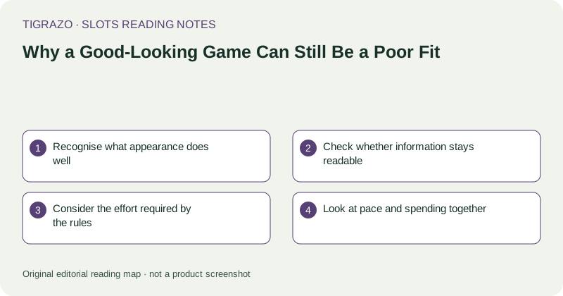
Recognise what appearance does well
Colour, music, animation, and character design can create a coherent mood. They help explain why a game catches your attention. That response is real, but it answers an aesthetic question rather than a mathematical one. A polished presentation does not establish generous expected returns, frequent meaningful prizes, or straightforward feature conditions.
Give visual appeal its own line in your notes. Separating it from other observations prevents a positive first impression from becoming an unearned endorsement of everything else.
Check whether information stays readable
Small symbols, low-contrast text, crowded controls, and lengthy animations may make a beautiful screen tiring to interpret. Notice whether you can distinguish the selected stake from the last award and whether a prize explanation remains available after the animation ends.
Accessibility is not an optional extra in this assessment. If important information is difficult for you to perceive, the game may be a poor fit regardless of how much you like its artwork.
Consider the effort required by the rules
Some games distribute their rules across base play, several features, separate symbol behaviours, and prize conditions. Complexity is not inherently bad design, but it asks for attention. You may simply prefer a reading task that has fewer exceptions.
- Can you explain an ordinary win without reopening the panel?
- Can you identify which features have separate conditions?
- Do you understand the unit used for displayed prizes?
- Are you relying on the animation to explain an unresolved rule?
Look at pace and spending together
A comfortable-looking interface can still support a pace you do not want. Faster rounds increase the number of wagers that can occur within a period. They do not improve the expected outcome of each independently determined spin.
In a hypothetical comparison, forty rounds at 0.25 units create 10 units of wagers, while eighty rounds at the same stake create 20 units. That is a difference in exposure, even though the artwork and individual stake remain unchanged. Wager volume is not identical to net loss, but it matters when considering cost.
Let mismatch be an ordinary conclusion
You do not owe an appealing design a longer evaluation. A clear note might say that the theme is enjoyable but the prize labels are difficult to follow, or that the visual density demands more concentration than you want to spend.
Those are sufficient conclusions. Choosing not to continue need not imply the game is universally bad; it can simply mean its presentation, complexity, or pace does not suit your needs.